A Multi-Date Picker for SwiftUI
A date picker that allows you to select more than a single day.
The information presented here is now obsolete with the introduction of iOS 16 and SwiftUI 4.0.
Many applications have the need to pick a date. But what if you have an app that requires more than one date to be selected by the user? Perhaps you are writing a hotel reservation system or an employee scheduler and need the user to select starting and ending dates or just all the days they will be working this month.
MultiDatePicker
To help facilitate that task, I’ve written the MultiDatePicker, a handy component that can deliver a single date, a collection of dates, or a date range, to your application. You can see screen shots below.
The MultiDatePicker is pretty easy to use. You first need to decide which selection mode you need: a single day, a collection of days, or a range. You create a @State var to hold the value and pass that to one of the MultiDatePicker’s constructors. When the user makes their selection your binding will be updated.
Source for
MultiDatePickercan be found in my GitHub Library
Here are some examples:
Single Date
@State var selectedDate = Date()MultiDatePicker(singleDay: self.$selectedDate)
In singleDay selection mode, the MultiDatePicker acts similarly to the SwiftUI DatePicker component. Unlike the SwiftUI component, MultiDatePicker can only select dates, not times.
The calendar in the control shows the month/year of the singleDay given.
Collection of Dates
@State var anyDays = [Date]()MultiDatePicker(anyDays: self.$anyDays)
With the anyDays selection mode, the binding contains the user’s selected day sorted in ascending order. If the selection order matters, you should write a custom binding to intercept the changes or use the onChanged modifier.
Tapping a day will select it and add it to the collection; tapping the day again will de-select it and remove it from the collection.
The calendar in the control will show the month/year of the first date in the anyDays array. If the array is empty the calendar will show the current month and year.
Date Range
@State var dateRange: ClosedRange<Date>? = nilMultiDatePicker(dateRange: self.$dateRange)
With the dateRange selection mode, the binding is not changed until the user selects two dates (the order does not matter, the MultiDatePicker will sort them). For example, if the user picks two dates, the binding will have that range. If the user then taps a third date, the binding reverts to nil until the user taps a fourth date.
The calendar in the control shows the month/year of the first date in the range given. If the dateRange is nil the control shows the current month and year.
The Model
Making all of this work is the model: the MDPModel. As with most SwiftUI components, the views are data driven with a model containing the data. Often you’ll have a service (a connection to a remove system or to something outside the app) that deposits information into a model which then causes the view to react to the change in the data and refresh itself with the changes.
In the case of the MultiDatePicker, there is no service, instead the model creates the data. And the data for the model are the days of the month in the calendar displayed. My example of MultiDatePicker shows how preparing the data up front can make writing the UI easier.
The model works from the control date - any Date will do, as only its month and year are important. Once the control date is set, the model constructs a calendar - an array of MDPDayOfMonth instances that represent each day. Days that are not displayed are giving a day number of zero (these are days before the beginning of the month and after the last day of the month). As the MDPDayOfMonth items are created, the model determines if each is selectable (see below), if one represents “today”, and what its actual Date is so that comparisons at runtime can be efficient.
Once the days have been created they are set into a @Published var which triggers the UI to refresh itself, displaying the calendar. The UI can then quickly examine each MDPDayOfMonth to see how it should appear (eg, draw a circle around “today” or highlight a selected day).
More Options
In addition to the selection mode, MultiDatePicker has other parameters, all of which have defaults.
Selectable Days
If you look at the Any Dates screen shot you can see that the weekend days are gray. These days are not selectable. The MultiDatePicker can be told which days are eligible for selection by using the includeDays parameter with a value of allDays (the default), weekendsOnly, or weekdaysOnly (shown in the screen shot).
Excluding Days
Other options you can use with MultiDatePicker are minDate and maxDate (both default to nil). If used, any dates before minDate or after maxDate are not eligible for selection and shown in gray.
Jumping Ahead (or Back)
The increment (>) and decrement (<) controls move the calendar forward or backward one month. If the user wants to skip to a specific month and year, they can tap on the month and year (which is a button) to bring up the month/year picker, as shown in the last screen shot.
The month/year picker replaces the calendar with two wheels to select a month and a year. Once the user has done that, they tap the month/year button again and the calendar returns, showing the newly selected month/year combination.
Weather Demo for SwiftUI
A SwiftUI app to help get you started writing your iOS apps.
When you are starting out learning a programming language or system, you often go through tutorials which give you a sense of what everything is about. But then you try to code something yourself and things get fuzzy. You read about concepts and techniques and try to put them together for your own work. Its really a learn-as-go process.
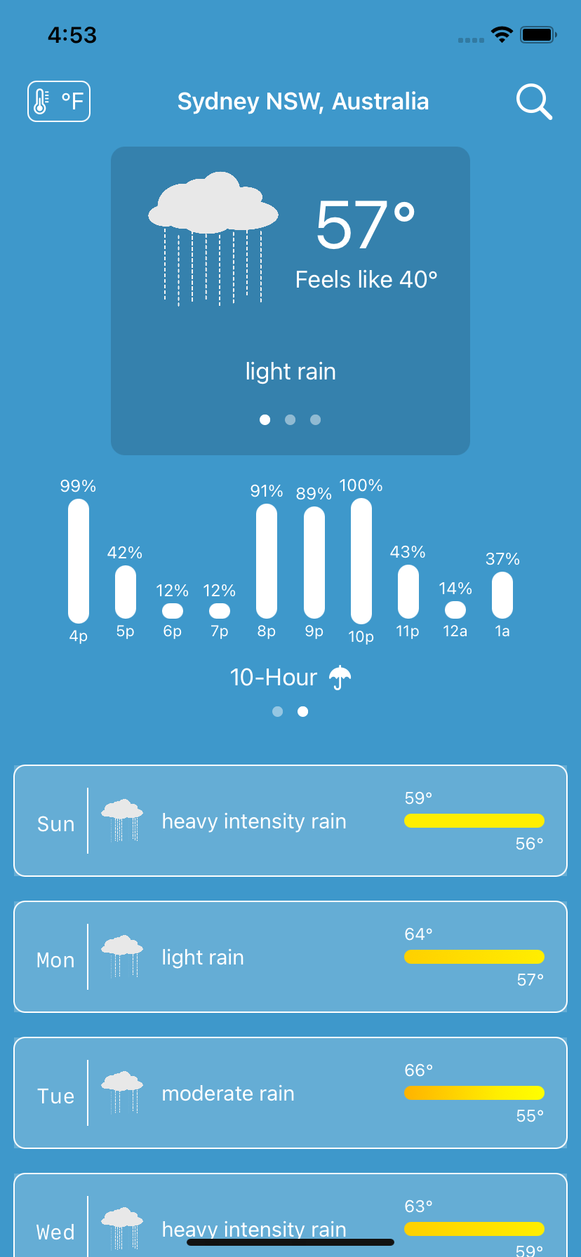
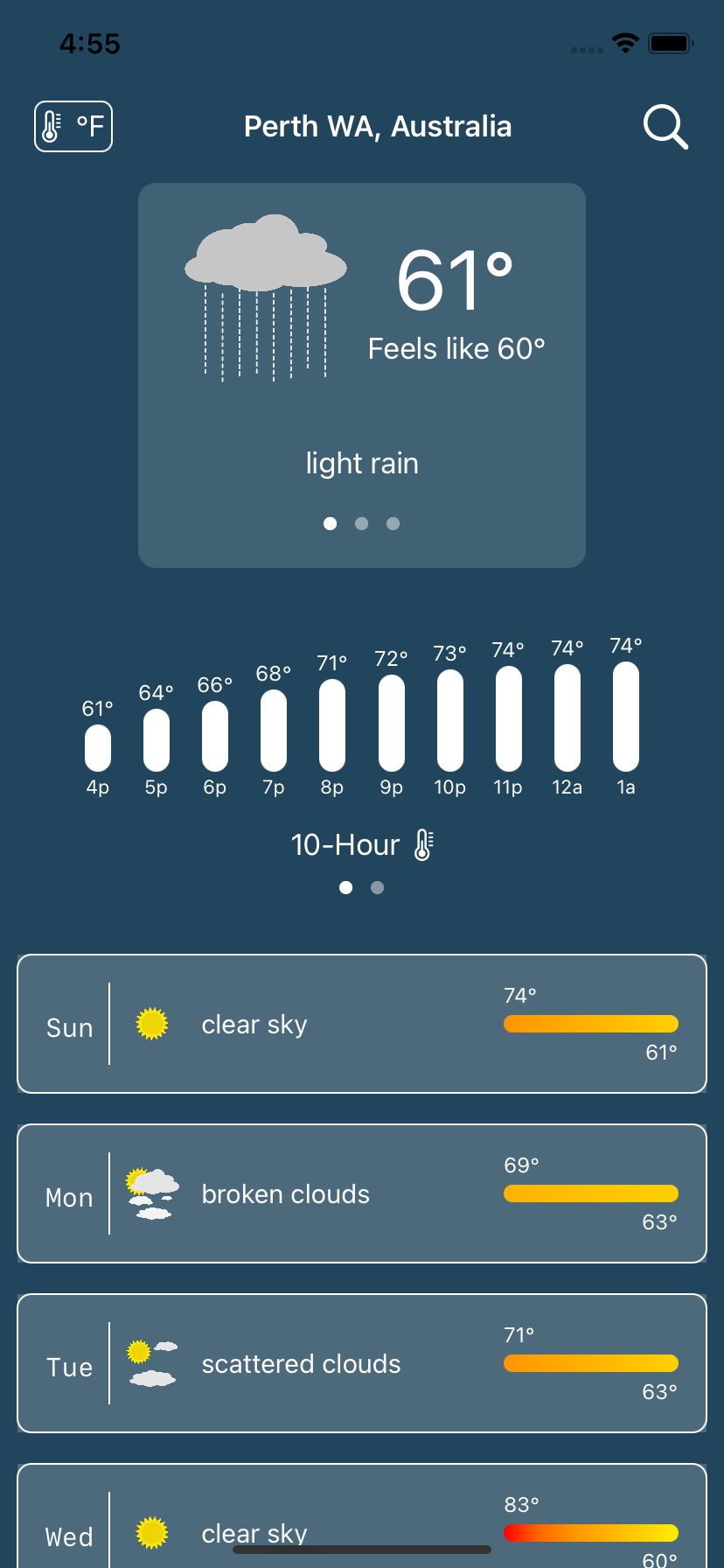
I thought I’d help out a little and I created a small, but complete, SwiftUI app. The link to the GitHub repo is below. Its called “WeatherDemo” and, as the name suggests, is a weather app. I picked weather because there are a lot of weather apps so another one wouldn’t make any difference. More important though, the point of the app is straightforward but can cover a lot of topics. Being a small app its also easy to get your head around and understand the flow of the data and the lifecycle of the elements.
Here are the topics covered by WeatherDemo, in no particular order:
How to ask permission to get the device’s current location.
How to use Core Location to search for places.
How to use Core Data.
How to use URLSession with Combine to make REST API requests from openweathermap.org
How to use the Decodable protocol to digest JSON data from the remote request.
How to create custom SwiftUI components.
How to use the Size Trait Classes to handle different screen orientations.
How to create Extensions to classes.
How to do simple localization to support multiple languages.
How to use SVG images in SwiftUI apps.
The app requires iOS 14 and Xcode 12. You will also need an account with openweathermap.org (the free account is enough) in order to run the app.
You can download or clone the GitHub repository here at weatherdemo-ios.
There is an extensive README in that repository; this article is merely an introduction.
The WeatherDemo app’s structure goes like this:
Services are used to get the device location and to fetch weather information from openweathermap.org.
A controller (or model) coordinates between the services, fetching new weather information as needed. The controller is an
ObservableObjectand@Publisheda set of values which are observed by the UI components. These areCombineframework items.The
ForecastViewdisplays the weather data in the controller. Because of the way SwiftUI and Combine work, telling the controller to get weather info for a new location will cause theForecastViewto update.The
LocationSearchViewis asheetthat displays search history as well as search results while you type. Pick a search result and the controller fetches the weather for that location.
That’s really all there is to the app. You’ll find a folders for helper components for both the ForecastView and the LocationSearchView. These are custom SwiftUI components that do things like display the wind speed or a colored temperature bar or the search term field.
SwiftUI really encourages breaking your app down into small parts and composing your app out of the them. You will find that a lot but not 100% throughout the app - it gives you a chance in some places to try it out yourself.
One of the things the WeatherDemo app does is display a graphic that represents the weather (like the sun or moon in clear conditions). These images were hand drawn by me (I’m not bragging, as you’ll see, just pointing out there are no copyright issues with the images) using an SVG editor. Using SVG images in iOS app is very recent. Normally you create a graphic at three resolutions so iOS can choose the best one for the devices. As there are more and more iOS devices with different resolutions, it is much better to use scalable vector graphics. Not only do they look good across all devices, but it means there is only one image to maintain. Plus, most graphic artists can make SVG or export SVG fairly easily.
I hope you get something out of this project. I would not take WeatherDemo and hold it up as an exemplar of best practices or a template for all your endeavors. It is meant to be a bit of a hodgepodge to demonstrate techniques with a reasonable amount of coherence. With that in mind, enjoy!
SwiftUI 2.0 - First Days
A short tour of SwiftUI 2.0
I’ve spent the last couple of weeks or so looking into SwiftUI 2.0 and wanted to document my thoughts about it while it was relatively fresh. Its often good to go back and look at early impressions of things to see how your thoughts or opinions changed.
I’m pretty happy with SwiftUI 2.0 - Apple added some new “native” components and fixed some things that I had developed work-arounds for; now those are obsolete. I looked through a list of the new features and created a simple App to learn about each new thing. Then I spent time upgrading my two apps (Journal and Password) to be SwiftUI 2.0 compliant; as of this writing I have not yet released them to the Apple App Store.
Impressions
This is a brief description of some of the new components available in SwiftUI 2.0 and how I made use of them.
Maps
The idea of a native Map component was something I was looking forward to using. I created my own MapView for SwiftUI 1.0 using UIViewRepresentable. With SwiftUI 2.0 the expectation was that I could toss that aside.
Alas, not so quick. While SwiftUI 2.0 comes with a nice implementation of MKMapView, it lacks interactivity that I need. You can place annotations (markers or pins) on the map, but they are not tappable. And there does not seem to be a way to get the user’s current location to indicate or track.
I decided to stick with my own MapView for now. I’m sure Apple will address this somehow. This was the only component I was disappointed with.
Grids
One thing lacking in SwiftUI 1.0 was a way to present collections in columns or rows. What people have done is wrap UICollectionView to do this. With the new LazyVGrid and LazyHGrid you do not need to do that. The “lazy” part of their names means they won’t create any children until they need to. Some folks call these virtualized lists.
Laying out a grid is easy: You create an array of GridItem instances that describe how many columns or rows there should be and how they should be sized (basically fixed or variable). Then you just fill them. If you need to scroll them, wrap them in a ScrollView. Each element that’s being presented should be given enough information to fill itself out. I used a LazyHGrid to present a strip of photos that were taken near a Journal entry’s location. As each thumbnail is exposed it requests a UIImage from the Photo library on the device, showing an activity spinner (ProgressView for SwiftUI 2.0) until the image is available.
Scrolling
Speaking of scrolling, one pretty irritating shortcoming in SwiftUI 1.0 was the inability to scroll to a specific element within a ScrollView. To solve that, SwiftUI 2.0 introduces ScrollViewReader which you place inside of a ScrollView. If you want to have a specific item brought into view, just give the ScrollViewReader its ID. If you place your request inside of a withAnimation block, the ScrollView will slide nicely right to the item.
I used this in my Journal app. When the app opens it shows a calendar. If you tap on a date, the next screen is a list of all of the entries in the month and it scrolls the view to the date you selected. In the SwiftUI 1.0 version I used a wrapped UITableView to accomplish that. Now I can discard that part to do this exclusively in SwiftUI 2.0. This really reduced the footprint of the app and it seems to be a bit quicker, too.
Tabs
You’re probably familiar with using a tabbed application: the bottom of the screen has icons and labels for different sections of the app. Facebook for example, has your home, market place, notifications, etc. Creating these with SwiftUI 2.0 and TabView is pretty easy.
There is however, something more that TabView can do for you: paging. You know those screens that have tiny dots at the bottom and you swipe left and right to go between them? Well by simply using the tabViewStyle modifier with TabView and giving it a PageTabViewStyle specifier, you turn your old tabs into pages. Pretty handy.
I used this with my Journal app to present a set of full-size images that might be associated with a journal entry. Once you tap on a thumbnail in the LazyHGrid, that action displays a new screen with the full size images. You can zoom and pan on them (like Instagram) or swipe to go to another image without returning to the previous screen to select a new image.
Final Thoughts
What impresses me most is that Apple really stuck with its view composition model. For example, the LazyHGrid does not scroll by itself. If you want that behavior, place it inside of a ScrollView. Likewise, you can add functionality with modifiers rather than having massive components with tons of options that you won’t use most of the time. Same goes for animation. The ScrollView will not slide to show you the item you want, you have to trigger it by placing your change inside of an animation block. This allows you to decide if you want the list to bounce into view, zip and slow down, take 2 minutes, etc.; it’s up to you.
I gave you a little taste of what is available in SwiftUI 2.0. I did not include changes to the Combine framework and Swift 5.3, but those were also welcome and I barely touched the surface of what’s capable there.
If you have been holding off going to SwiftUI, now is the best time to jump in. It is far more robust and capable than SwiftUI 1.0 - and I built a commercial app with that!
It’s so much easier and faster to build apps with SwiftUI. All of the tedium of layout constraints, actions, outlets, storyboards, XIB files, are - poof - gone.
And you do not have to go 100% into a re-write. Using the SwiftUI UIHostingController you can wrap SwiftUI components into your UIKit code. So if you have a new screen to develop that has animation or a tricky list layout, give SwiftUI 2.0 a try.
I will try and and do another one of these in a few months as I get more experience and we can compare notes.


