Using Targets to structure your IOS app
Using targets to separate your concerns.
Just thought I’d pass this concept along. If your app is big (code-wise) or is going to be big or you think it may become big, here is a technique to help you manage all of the parts in a nice, testable, compact way.
When you first start out writing iOS apps, you may have a vague notion about “targets” which is, simply, the thing that gets built. In other words, your app; the target of the build process is your app. You may have asked yourself, why would I want to use multiple targets in a project? One reason may be you have a Watch app to complement your app or you may have a Widget. Here, though, I will show you how you can use targets to organize your code to make your app more manageable.
I don’t have a GitHub repository this time, because the code itself is almost irrelevant. Its the concept here that’s important.
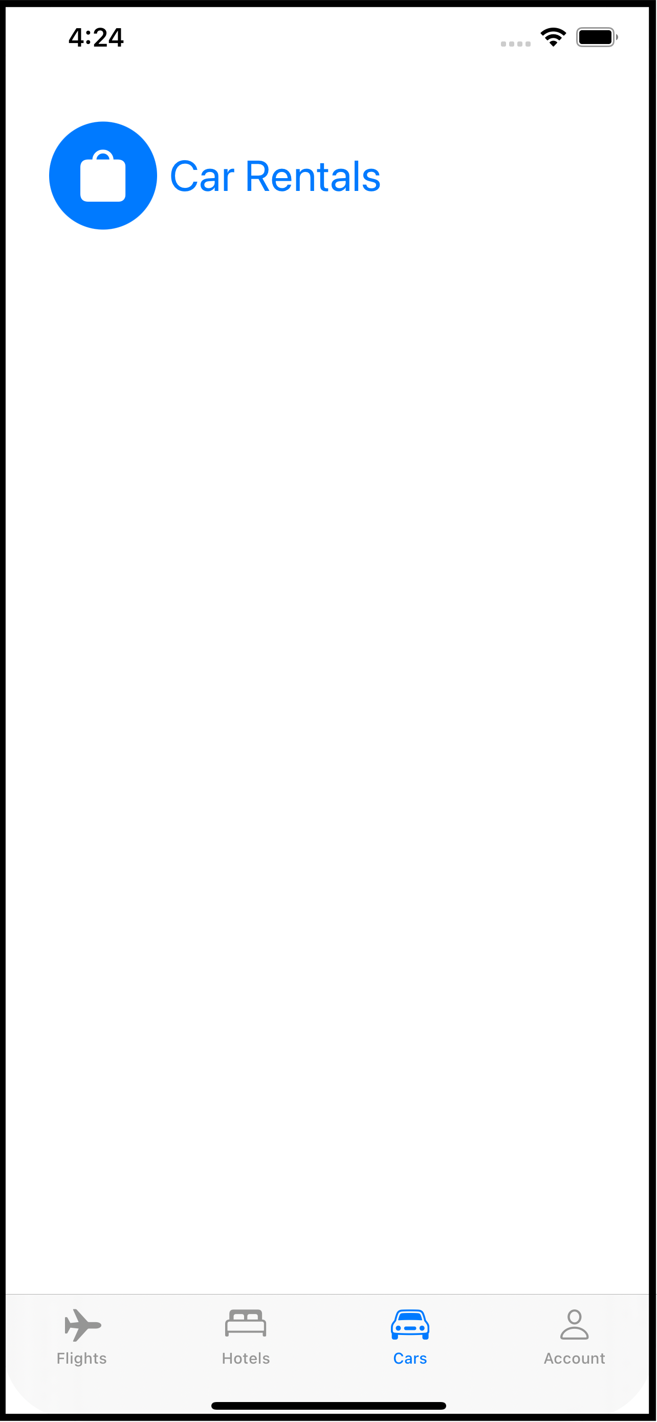
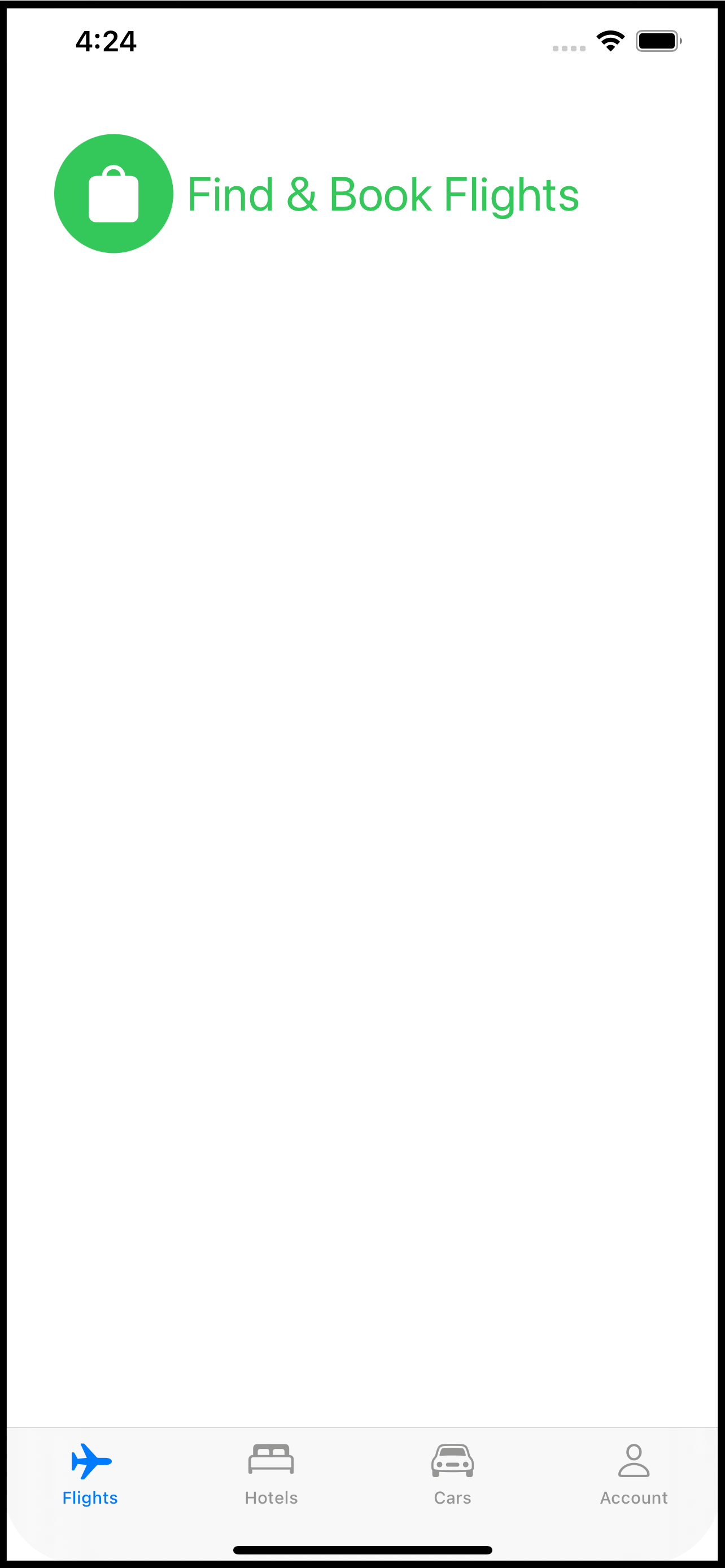
So imagine you have a travel app. The app has four distinct parts: booking a flight, reserving a hotel room, renting a car, and managing your travel account. For the sake of making my point, further imagine each of these parts has its own tab in the app. It is not important to this technique that your app use tabs but it is important that you divide your app into separate functional bits. Using tabs as an example makes it easier to conceptualize.
When you think about this app, it’s pretty clear that there are four distinct UI pieces. But there are a lot of things each piece shares. For example, string, graphic and color assets. Your app might also need to present a login screen at any time on any tab. Your app might have extensions to classes like Date, String, or View that are used on all of the screens involved with each tab.
Your app could be divided as follows (not comprehensive, just a sample):
Common Code
Assets (string, color, graphic)
Services (connection to remote systems)
Class extensions (Date, String, etc.)
Data models
Shared views (calendar picker, price calculator, chat with travel agent, login)
The App Itself
AppDelegateContentView
Booking tab
Booking View
Flight schedules
Flight selector
Hotel tab
Hotel View
Reservation systems
Car rental tab
Car Rental View
Car rental company selector
Rates and discounts view
Account tab
Profile View
Preferences and personal settings
Payment information
One more thing for your imagination: can you see developing each of things things almost independently? For example, booking flights by designing the screens to do that, updating the common data models, sending and receiving data between the app and the backend booking systems. That set of views that make up the booking tab is almost in and of itself, an app.
And this is where Xcode targets come in. Each of those bullet points above could be an Xcode target. Doing that separates the parts and allows each part to be independently built and tested. Each time you create something you can ask, “Is this going to be used exclusively here or could it be used in another part of the app?” If the answer is the latter, then you put that into the Common target.
Doing this is easier than you might think. If you already have an Xcode project set up to build an iOS app, follow these steps to add another target:
Select File-> New -> Target from the File menu.
In the dialog that appears, scroll down to the Application section and pick “App”. If you are a seasoned Xcode you, you could actually use something else, but picking an actual App as a new target allows you to run your code on its own. For example, as you build the Account target, your app can log into the backend system, create a user, update it, etc. You do not need to launch the whole (Main) app to test these pieces.
On the next screen, fill in the name (eg BookingModule or BookingTab) and pick Finish.
Your target is now part of your Xcode project. If you look at the schemes menu, you will see each appearing which means each can be built, tested, and run separately.
Go head back to the Common target which you can add in exactly the same way. The purpose of this target is to be a single place for all of the code that’s shared between the other targets. To use any of the code in this target (Common) with another target (say, Booking), you need to make sure it is included in the build for that target.
Pick a file in the Common target and open the File Inspector (options+command+1). There’s a section in the panel called “Target Membership”. The Common target will already be selected. Check the box next to all of the other targets that will use this common file.
You may have heard or read that building your own SDK is a good idea (such as the code that would be in the Common target of this example). And it is - it certainly makes building your app faster as the code in the SDK is built once, on its own, and just linked into the app. That would be the next level beyond this technique and if you want to do that, go for it!
Once all of the files are selected to be included in the right targets you can assemble the app in the App target. This will be the original target that is the app itself. It will be just like building an app normally, except most of the files will reside in other targets.
The advantages to this technique are:
Forces you to think about your app as an assembly of parts.
Each part of the app is nearly independent and can be run and tested, to some degree, without the other parts. Don’t under estimate the value here. While you develop the hotel reservation target, your QA team could be testing the flight booking target.
Organizing common code into its own target makes it easier to update as the changes apply across the app.
Faster on-boarding of new team members and its easier to divide up the work.
How you divide your app up is, of course, up to you. But if this gets you thinking about code organization - even if you just use folders instead of targets - then it will be worth it. New members to the team will have a much easier time figuring out where things are and how the app works.
Happy Coding
Modal Dialogs with SwiftUI
A centralized way to display modal dialogs from anywhere inside a SwiftUI app.
A modal dialog is an interaction that interrupts the normal workflow and prevents anything happening except the dialog. The old Alert is a perfect example. When an Alert comes up you can do nothing but engage with the Alert.
SwiftUI has the Alert, but if you want to roll your own modal dialogs you have a take some things into account. You can use a SwiftUI Alert anywhere in your app. When the Alert is activated, it rises about all other content and puts up an input block to the rest of your app. Once the Alert has been addressed, it and the block go away.
And this is a key point: it rises above all other content no matter where in your View hierarchy it has been dispatched. If you want this same behavior in a custom modal dialog, you have to place it at the top of your View hierarchy, generally on the ContentView or whatever you are using as your main View.
I’ve come up with a way that makes it easier to mange and allows you to invoke your dialog anywhere in your app. The solution lies with two things: ObservableObject (in the form of a model) and enums with associated values.
A little while ago I wrote two blog articles: MultiDatePicker and custom sheets using .overlay. I’m going to combine these two in this article to show you what I came up with.
The Problem
First, it is not important that you use MultiDataPicker. I am using it here because its a control that takes a binding element and could work well as a modal dialog. But I could also use a TextField just as well. The custom sheets article basically moves the presentation of the sheet into a ViewModifier. I will use some of that here.
Secondly, I am creating a single modal dialog, but if you want to have different types (eg, pick a date, enter a phone number, rate a restaurant, etc.), you can easily adapt this example.
The idea is that from anywhere in your app you want to present the user with a modal dialog. The dialog should be above everything else and it should provide an input blocker so the user cannot use the app without addressing the modal dialog. Now I’m not saying using modal dialogs is a good or bad idea. But sometimes you need to get some info from the user at a particular point in time. For example:
You are on a travel site and pick the tab at the bottom for hotels.
The tab shows you a view with a list of hotels. You tap one of the hotels and navigates to a detail view about that hotel.
You pick the “Reservations” button, taking you a step deeper into the app to the reservations view.
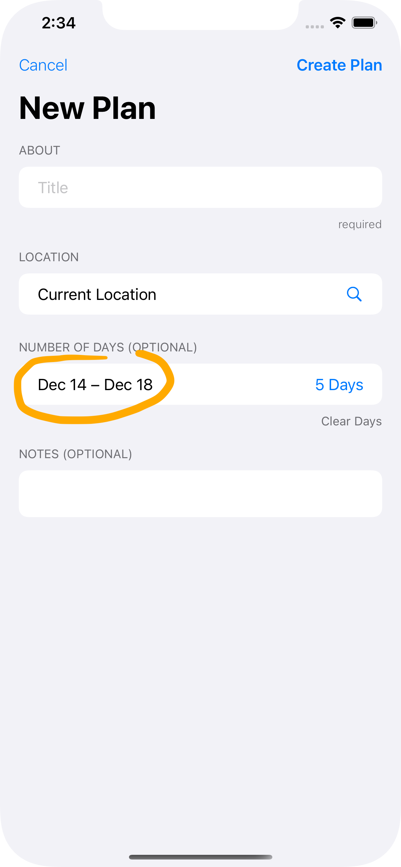
Now you are on the Reservations view with a place to set your dates. You have traveled to:
ContentView->Hotel List View->Hotel Detail View->Reservations View.You now tap the dates field. If the app uses the SwiftUI
DatePickeryou are golden because it already operates as a modal dialog. But the developer of this app wants you to pick a date range (eg, check in, check out) decided to useMultiDatePickerinstead.The
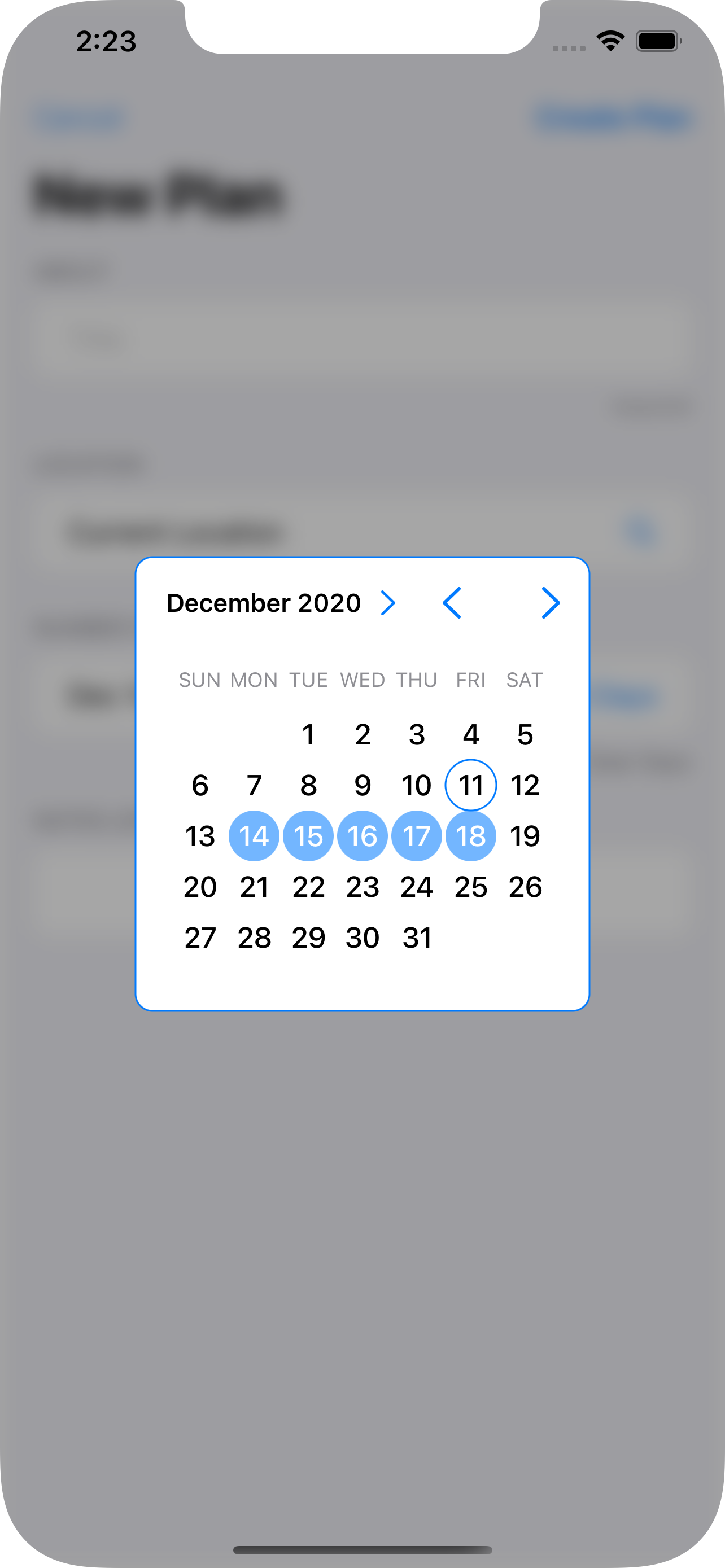
MultiDatePickerappears floating above all other contents - the Navigation bar and the Tab bar, too, not just the content of the Reservations Screen (which might actually be a sub-area of another screen).
The Solution
The Dialog Model
We begin with the Dialog Model. This is a class that implements ObservableObject because we want to use it to set the type of dialog to open.
class DialogModel: NSObject, ObservableObject {
    @Published var dialogType: DialogType = .none
}
You see that it has a single @Published value for the dialogType. That is an enum defined as follows:
public enum DialogType {
    case none
    case dateDialog(Binding<ClosedRange<Date>?>)
  // add more enum cases and associated values for each dialog type.
}
What’s interesting about this enum is that for the dateDialog member, there is an associated value of ClosedRange<Date>? wrapped as a Binding. And it just so happens the MultiDatePicker has an initializer that also calls for an optional closed date range.
The Dialog Modifier
The next thing we are going to do is create a ViewModifier to activate the modal dialog based on the dialogType value of the DialogModel.
private struct DialogModifier: ViewModifier {

    // 1.
    @ObservedObject var dialogModel: DialogModel

    func body(content: Content) -> some View {
        content
            // 2.
            .overlay(
                Group {
                    switch dialogModel.dialogType {
                    // 3.
                    case .dateDialog(let dateRange):
                        ZStack {
                           // 4.
                            Color.black.opacity(0.35)
                                .zIndex(0)
                                .onTapGesture {
                                    withAnimation {
                                        self.dialogModel.dialogType = .none
                                    }
                                }
                            // 5.
                            MultiDatePicker(dateRange: dateRange)
                                .zIndex(1)
                        }
                        .edgesIgnoringSafeArea(.all)
                    default:
                        EmptyView()
                    }
                }
            )
    }
}
Some important bits about this DialogModifier:
This
ViewModifierneeds to use theDialogModelinstance, so it is declared as an@ObservedObjectbecause it implements theObservableObjectprotocol and because we want this to react to changes in its@Publishedmember,dialogType.An overlay is used to place Views above the
content. AGroupis used to select what to put into the overlay: anEmptyViewif no dialog is being displayed or aZStackwith the overlay Views.A
switchandcasestatement select for the dialog and grabs theBindingfrom the enum’s associated value.A simple
Coloris used for the blocker and a tap gesture set to make it possible to dismiss the dialog.The
MultiDatePickeritself, passing theenum’s associated value (dateRange) at initialization.
One thing to note: use static .zIndex values if using transitions with Views (which I did not use here, but you might want them).
Now let’s make this clean to use in the application with a little View extension:
extension View {
    func dialog(_ model: DialogModel) -> some View {
        self.modifier(DialogModifier(dialogModel: model))
    }
}
Applying the Dialog Modifier
This little extension function makes it a little bit nicer to apply the modifier:
import SwiftUI

@main
struct PlanWizardApp: App {
    // 1.
    @StateObject var dialogModel = DialogModel()

    var body: some Scene {
        WindowGroup {
            ContentView()
                // 2.
                .environmentObject(dialogModel)
                // 3.
                .dialog(dialogModel)
        }
    }
}
Declare and instantiate the
DialogModel. You want this to stick around so use@StateObject.Pass the
DialogModeldown into the app content views.Apply the
DialogModifierthrough the handy extension function, passing along theDialogModel.
That has set everything up. I told you that the dialogs needed to be at the top level, so it is in the App definition! When the DialogModel’s dialogType enum is set, the DialogModifier will take notice and display the appropriate dialog as an overlay on ContentView.
Showing the Dialog
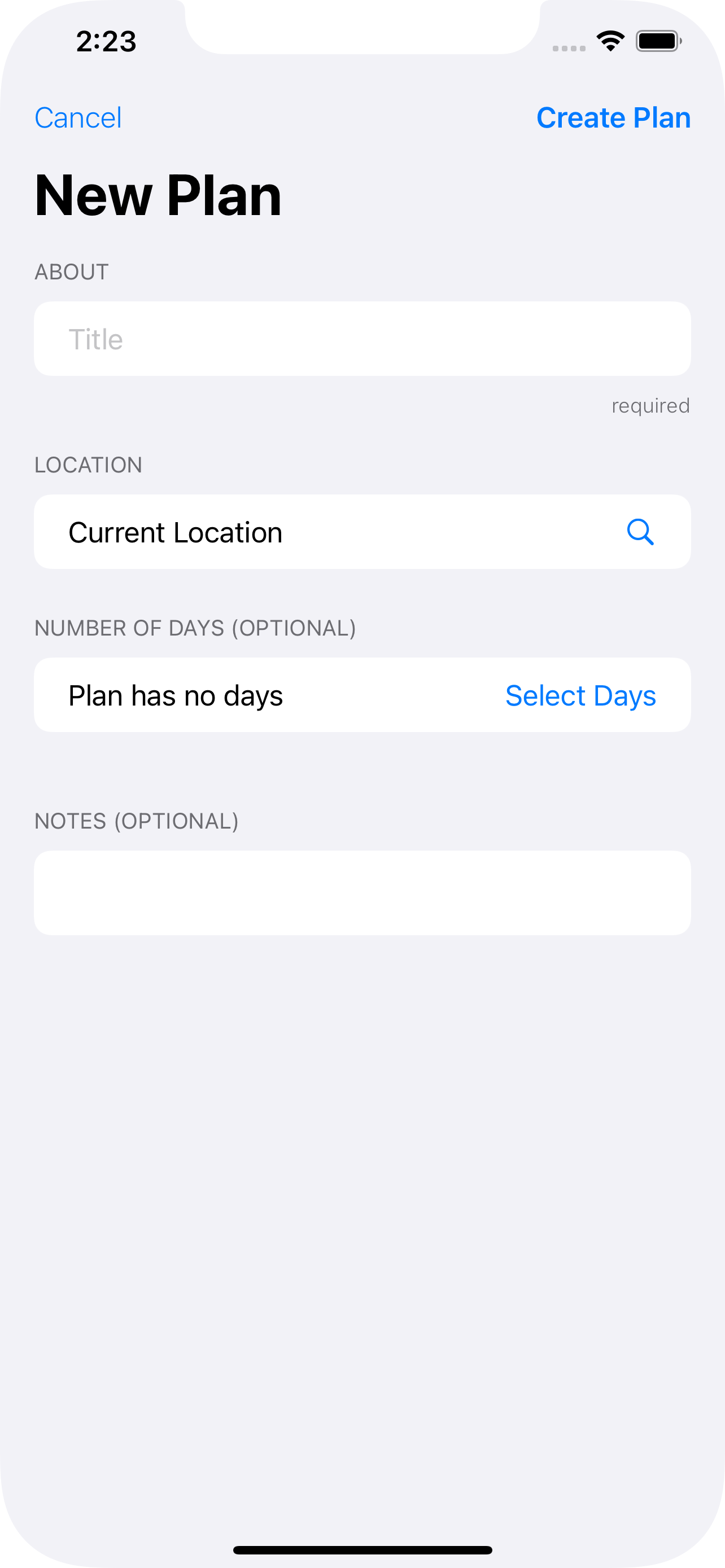
So how do you actually make this work? Let’s assume you’ve got a Form someplace and it is from there you want to pop up the MultiDatePicker and display a date:
// 1.
@EnvironmentObject var dialogModel: DialogModel
// 2.
@State private var dateRange: ClosedRange<Date>? = nil
Form {
  // ...
  Section(header: Text("Dates")) {
    HStack {
      Text("\(dateRange)") // 3.
      Spacer()
      Button("Pick Dates") {
        // 4.
        self.dialogModel.dialogType = .dateDialog(self.$dateRange)
      }
    }
  }
}
Bring in the
DialogModelfor use in this View (see step 4).Declare a
varto hold the selected date range. In a real app you probably have this as part of some data model.Display the range selected. You will need a little more code here, but the idea is to show that this value has in fact changed.
Here is the key. When the
Pick Datesbutton is tapped, theDialogModelis set with the.dateDialogvalue and the associated value for theenumis set as a binding toself.dateRange. This is passed into theMultiDatePickerby theDateModifier. And because thedialogTypeis an@Publishedvarof theDialogModel, SwiftUI will cause theDateModifierto be executed and theMultiDatePickerwill appear as an overlay ofContentViewinside aZStack.
Summary
Maybe the ending was a little anticlimactic, but I think it paid off nicely.
Overlays only apply to the View they are attached to. If you want a “dialog” to appear above all other content you have to place the overlay on the topmost View. In this case,
ContentView. And do so in theAppdefinition.Overlays are modifiers, so a good place to encapsulate them is with a custom modifier like
DialogModifier. It can check a flag to see if the dialog view should be displayed or not. In this case itsdialogTypeof theDialogModel.You need to communicate the desire to see the dialog from anywhere in the app code all the way up to the
appdefinition. The best way to do that in SwiftUI is with anObservableObjectshared throughout the app using@EnvironmentObject(you could also define this as an@Environmentif you prefer).You also need to communicate data from the dialog back to whatever wants to see it (generally to a
@Statevar declared in the View that triggered the dialog’s appearance). One way to do that is through anenumwith an associated value that is aBinding.Combining the
enumsetter with@Publishedin theObservableObjectmodel make a good way to trigger the appearance of the dialog as well as provide a data bridge using aBinding.
So there you have it. I hope if you need dialogs (or even a centralized location for .sheet and .alert modifiers) you will find this solution handy.
A Year of SwiftUI
At WWDC 2019 (that’s last year), Apple introduced an amazing new UI framework - SwiftUI. Its introduction was (for me at least) on par with the announcement of Swift itself. I’d like to take you through my adventure with SwiftUI - version 1 - to show what you’ve missed and to hopefully, prepare you for Swift 2.0
Reactions
I had recently been working with React Native and was planning to re-write the app for iOS. This was well after WWDC 2019, so I had already heard of SwiftUI. My work with React Native was important in that I was already in the “reactive” frame of mind. That is, I worked with a UI whose display was state driven and bound tightly with the state. If you aren’t familiar with reactive programming here is a quick snapshot:
Your UI is composed of controls whose content (or appearance) is tied to a value in the component’s state. For example, a label whose’s
textproperty is the value ofstate.amount. Whenever you changeamountin the state, the UI automatically refreshes with the updated value. In other words, you do not programmatically assign the label an updated value; instead, the label draws its value from the state. Or, the UI reacts to changes in the state. Clever, huh?
Having been thinking along those lines, I started looking into SwiftUI. Imagine my surprise at seeing @State and talk about the UI reacting to changes in the state. Apple had gone done their own version of reactive programming! And it wasn’t just a little nod toward it - it was full-fledged deep end.
SwiftUI is only part of the new offering. Along with updates to Swift itself (which are crucial to making SwiftUI syntax so easy) is the
Combineframework. Combine is what allows@Stateto work and enables the Observer pattern to be so easily incorporated into your apps.
So this was going to be the new way forward to develop iOS apps. OK, that’s what I was going to do with this React Native re-written app: SwiftUI 100%.
There were a lot of bumps and challenges along the way. And you can read challenges as hair-pulling and doubt as to whether this was the right decision or not.
First off, I knew SwiftUI did not fully replace UIKit. I knew I had to write integration code - Apple’s own tutorials to get you started with SwiftUI did that. For example, the app would need to use MapKit and MKMapView was not a SwiftUI element. Fortunately Apple was prepared for this and provided a way to wrap UIKit components so that they would appear to be SwiftUI elements. Pretty neat actually.
Secondly, I had to really look at problems differently. How do I set up the UI and its state so that when values change the right parts of the UI change? How do I receive new values from the remote service and get the UI to reflect those new values? How I put up a date chooser? How can I make scrolling through a 2000 element list faster? The challenges just kept coming.
A Model Year
You may be familiar with the “massive view controller” problem. This is where you pack everything and the kitchen sink into a single UIViewController file. You put access to your data, manipulations for that data, formatting that data, etc. all into the file whose real job is to get the UIView to display. It is easy to fall prey to this, especially as you are flushing out ideas or doing prototyping.
And this exactly what I started do with SwiftUI. I wasn’t concerned at first with separation of concerns - I was more interested in understanding how SwiftUI worked. But in forgoing this design pattern, I actually missed a key part of how SwiftUI works. What happened was that I was trying to get the screen to see changes the code was making, but they weren’t showing up.
I took a step back and realized that I was neglecting a very powerful concept in SwiftUI - the model. It’s pretty simple: you put your data into a class that has functions to manipulate it and then make the UI observe changes to it.
SwiftUI provides ObservableObject for this purpose; it’s part of Combine. When you make a class Observable, you can select properties to be @Published which sets up the observer pattern and all the code needed to watch for changes.
I pulled a lot of code out the UI classes and into models. I wound up with lots of models - essentially one per “screen” with some go-betweens. This allowed me to just set up the binding between the UI and the data in the model, have code - like remote server call handlers - update the appropriate models which would then automatically trigger the UI to change. Voila - an app!
Summary
As often as I questioned my decision to use SwiftUI, I just as often determined it was the right path. Apple was going to make this its de facto way to write apps. If you wanted to be in the lead position and wanted to take advantage any new stuff, you needed to be with SwiftUI.
And look what happed at WWDC 2020: Widgets and App Clips. You write those in SwiftUI. And - maybe even more important - cross device deployment. Your app can run on an Apple Watch, iPhone, iPad, Apple TV, and macOS - one app. SwiftUI’s runtime makes sure your app looks the best for the device and behaves appropriately. I’m sure there’s some tweaking you do in the app to actually make that happen, but Apple’s done all the heavy lifting for you - IF you use SwiftUI.
A lot of folks have been afraid to take the plunge, citing the old “SwiftUI is 1.0 and will change or is buggy.” Yeah that was true. So now you’ve got SwiftUI 2.0 on the horizon - do you want to be a leader or do you want to hang back and eat dust?
Collapsable Section Headers in SwiftUI
Have a SwiftUI list with a lot of items? Break it into sections and make each section collapsable. Read on….
Let’s say you have this SwiftUI List with a bunch of different sections. It might be nice if users could tap on the section header and have that section collapse. Its actually pretty easy to do this, you just need a few parts.
Model
Start with a model, which we’ll call SectionModel. It is an ObservableObject because you want SwiftUI to recognize when it changes and redraw the UI. The model’s job is to know which sections are open and which are not.
// 1
class SectionModel: NSObject, ObservableObject {
    // 2
    @Published var sections: [String:Bool] = [String:Bool]()

    func isOpen(title: String) -> Bool {
        // 3
        if let value = sections[title] {
            return value
        } else {
            return true
        }
    }

    // 4
    func toggle(title: String) {
        let current = sections[title] ?? true
        withAnimation {
            sections[title] = !current
        }
    }
}
Declare the SectionModel to implement the Observable protocol. This will allow it to be a @ObservedObject later.
The sections dictionary holds the Bool to say whether or not the section is open (true) or closed (false). This is marked to be @Published so SwiftUI knows it should be watched for changes.
The isOpen function looks to see if a section, by its title, has a value and if so, returns it. If the section has not yet been toggled open or closed, return true - by default all sections are open. You can return false if you want the List to initially show all the sections as closed.
The toggle() function simple inverts the value of the section state and again uses true as the default state.
Section Header
Now we need a custom Section header. This will be simple also: a Text, a Spacer, and an Image that shows the section open or closed.
// 1
struct CategoryHeader: View {
    var title: String
    // 2
    @ObservedObject var model: SectionModel
    var body: some View {
        HStack {
            Text(title)
            Spacer()
            // 3
            Image(systemName: model.isOpen(title: title) ?
                "chevron.down" :
                "chevron.up")
        }
        // 4
        .contentShape(Rectangle())
        .onTapGesture {
            // 5
            self.model.toggle(title: self.title)
        }
    }
}
Create the CategoryHeader as a SwiftUI View struct. We are calling this “CategoryHeader” to avoid confusion with header part of the SwiftUI Section.
We are going to pass to this struct the SectionModel and mark it as an @ObservedObject so SwiftUI will notice when it changes (from the SectionModel toggle() function).
The Image displayed depends on the state of the section’s “openness”.
Use a contentShape of Rectangle so that the user can tap anywhere in the header to open or close it. Without contentShape the user could only tap on the title or the chevron.
Adding the onTapGesture makes it possible for the user to tap the section header to open or close which is handled by calling on the model.
When the user taps the header, the model just changes the values inside its sections dictionary. Because this is an observed property (@Published inside an ObservableObject), SwiftUI will detect that change and redraw the header.
The List
Now to modify the List. The outer ForEach is going through your primary model which is (I assume) divided into the sections. So each section needs to display the header. Whether or not its content is showing depends on the value in the SectionModel. The List looks like this:
List {
    // 1
    ForEach(self.dataModel, id:\.self) { data in
       // 2
       Section(
           header: CategoryHeader(
                        title: data.title,
                        model: self.sections)
      ) {
          // 3
          if self.sections.isOpen(title: data.title) {
              // a ForEach to render all of the items in this section
          } else {
              EmptyView()
          }
    }
}
The outer ForEach is looping through your data model, extracting a single item.
The SwiftUI section is given the CategoryHeader defined earlier with the title and model (which will be defined in a moment).
If the section for this item is open (based on the title), the ForEach will run and display the content rows. If it is closed, the else clause displays EmptyView().
Define the sectionModel outside of this View’s var body:
@ObservedObject private var sections = SectionModel()
When you tap on the header, its onTapGesture tells the model to toggle the value of the section’s open/closed state. Because the model is ObservableObject and has a Published member which is being changed, SwiftUI will redraw the List and your section will close (or open).
You’ll see that this animates. What SwiftUI is doing is comparing the last version of the List (section is open) to the new version (section is closed) and removes just the items being hidden.
And that’s all there is to it.

